Brand strategy, copywriting, and visual design for Franklin Fine Arts Center
Franklin Fine Arts Center originally approached me about creating a marketing brochure and needed someone to guide them through the process. While the brochure was the starting point of the project, we ended up creating a brand strategy they could then use to create content for any purpose. Plus a brochure.
uncovering franklin’s Hidden history
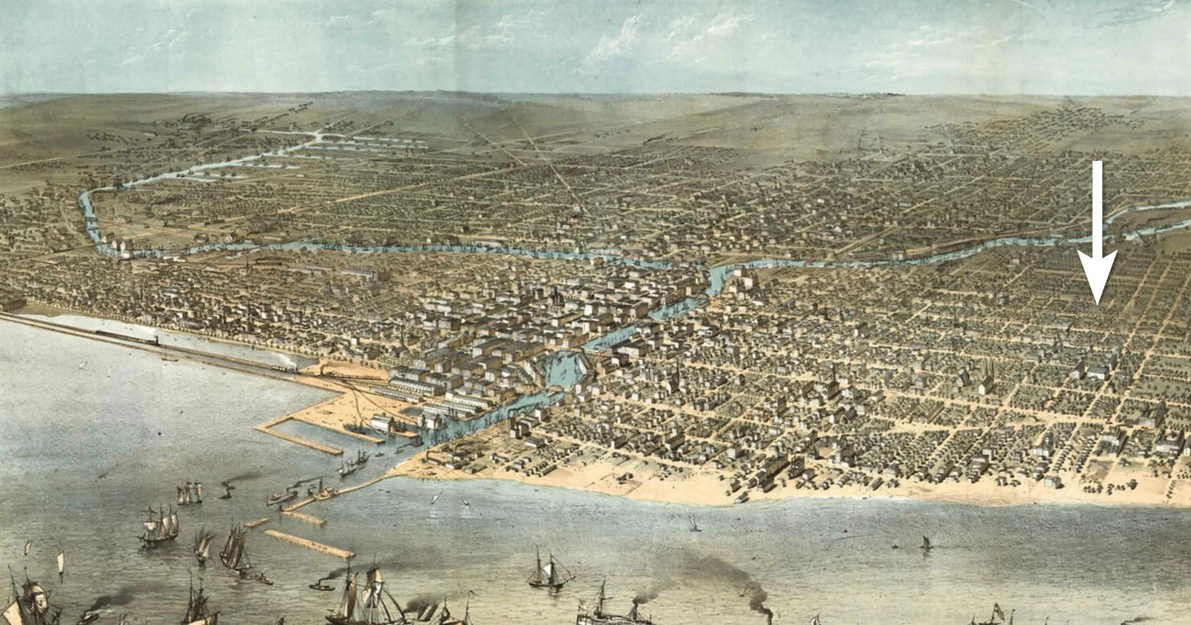
Franklin’s location in 1868
Franklin is a magnet elementary school in Chicago’s historic Old Town neighborhood. Originally opened in 1837 as School District No. 5, it’s the fifth-oldest public school in the city and became an arts-focused magnet school in 1979 in an effort to desegregate the public school system. The school is highly regarded, has appeared on national television, and regularly partners with acclaimed institutions like Steppenwolf, The Second City, and Music Will.

But while it has a long history and deep ties to art organizations, what the school had been using for recruiting material in the past was primarily bulleted lists of arts, academic, and after-school programs, state ratings, and other practical information like enrollment numbers. Great content for a website, and things parents want to know about, but not too exciting or alluring without witnessing the school firsthand.
Stand out from the crowd, be yourself
While Frankin didn’t need to tout its history and accolades it needed to do a better job of conveying the excitement of what makes them unique.
Beyond addressing the issue of content, most public schools tend to have similar-sounding messaging because they all have the same general goals. Which meant if Franklin expressed a clear purpose and persona that prospective families resonated with, it would also go a long way to distinguish them from the competition.
introducing Franklin, the magician
Franklin has a long history so the goal here was to identity or tease out the unique traits they already possessed, not start from scratch or to use the process as an opportunity to redefine goals.
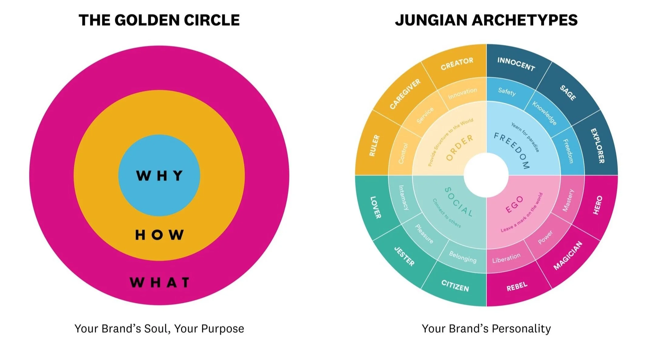
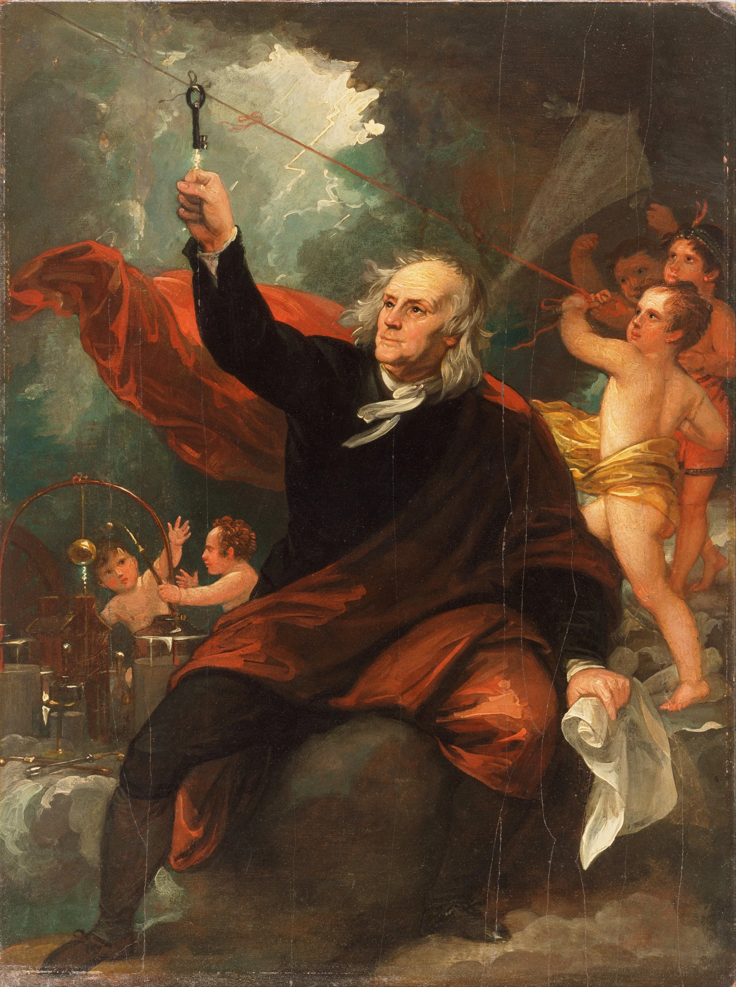
After distilling down a purpose statement that could be easily conveyed, we quickly narrowed down three relavant archetypes that align with Franklin’s purpose: the Sage who seeks truth and wisdom and yearns for paradise, the Creator who wants to create the world around them to achieve stability, and the Magician who seeks change in order to leave a mark on the world.
While the Sage and Creator both align with Franklin, the Magician came up again and again. Elementary school children are literally transformed between kindergarten and eighth grade. Ben Franklin tapped into the power of electricity with his kite experiment, fueling the industrial revolution. The staff at Franklin quite often talk about “the magic” of working there. And on and on. It was an easy decision in the end.
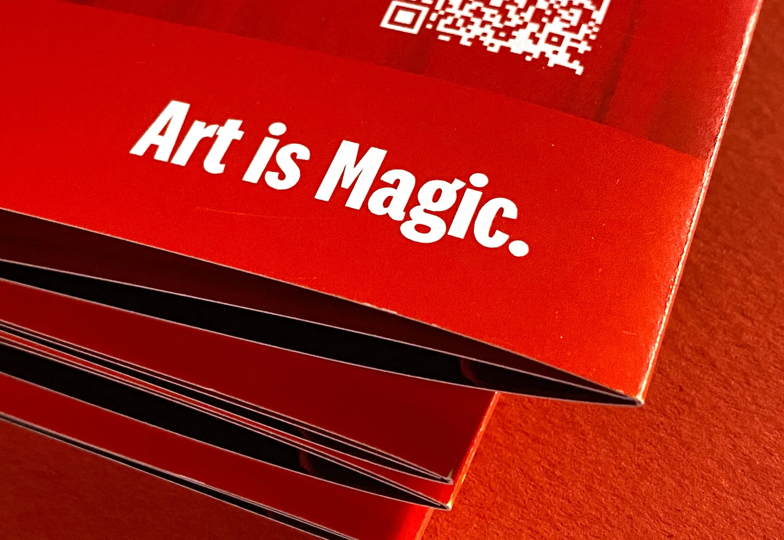
Art is magic
Now that Franklin had a renewed sense of self, we had better “north star” to explore messaging that was unique but felt natural and resonated with every audience they wanted to connect with, from the staff, to new prospects, to currently-enrolled students and their families.
Though the process we determined that Franklin’s purpose is to transform the world through its fine arts curriculum, that they align most with the archetype of a magician whose desire to transform the world through its magic, to make dreams come true. So if Franklin is a magician, art is its magic. Because …
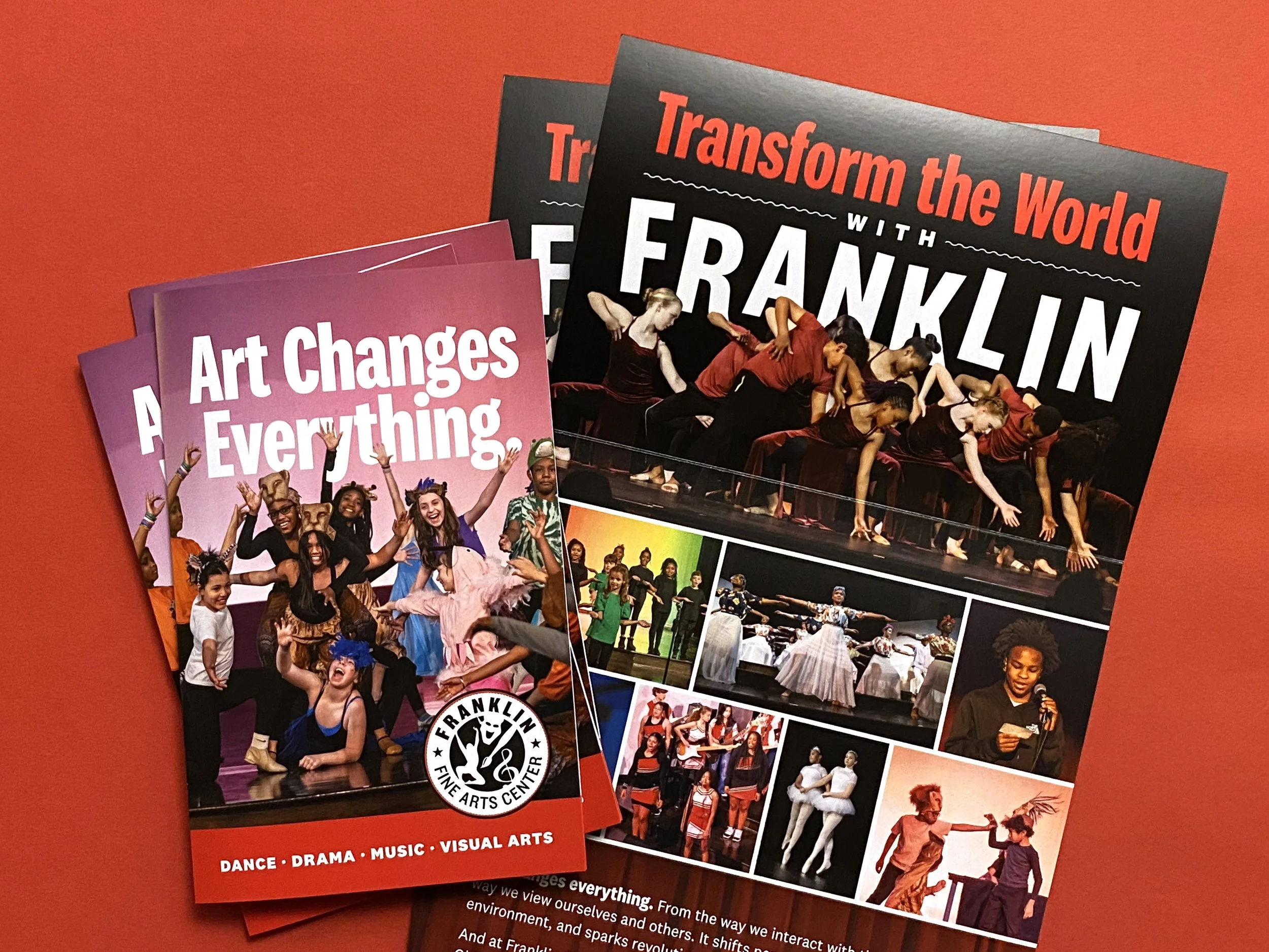
Art changes everything. From the way we interact with the world to the way we view ourselves and others. It shifts perspectives, transforms our environment, and sparks revolutions. It’s almost like having a magical power.
And at Franklin Fine Arts Center, a CPS magnet school located in Chicago’s Old Town Neighborhood, we inspire, cultivate, and empower every student to develop their creative talents so they can shift perspectives and leave a positive mark on the world. Join our school and find your own magical spark.
Franklin Fine Arts Center. Art is Magic.
The school loved the concept and felt the direction was natural to adopt because they often talk about how magical the place is. Though the tagline specifically refers to ‘magic’, the fundamental concept is about transformation through art and that’s how they can frame their future messaging.

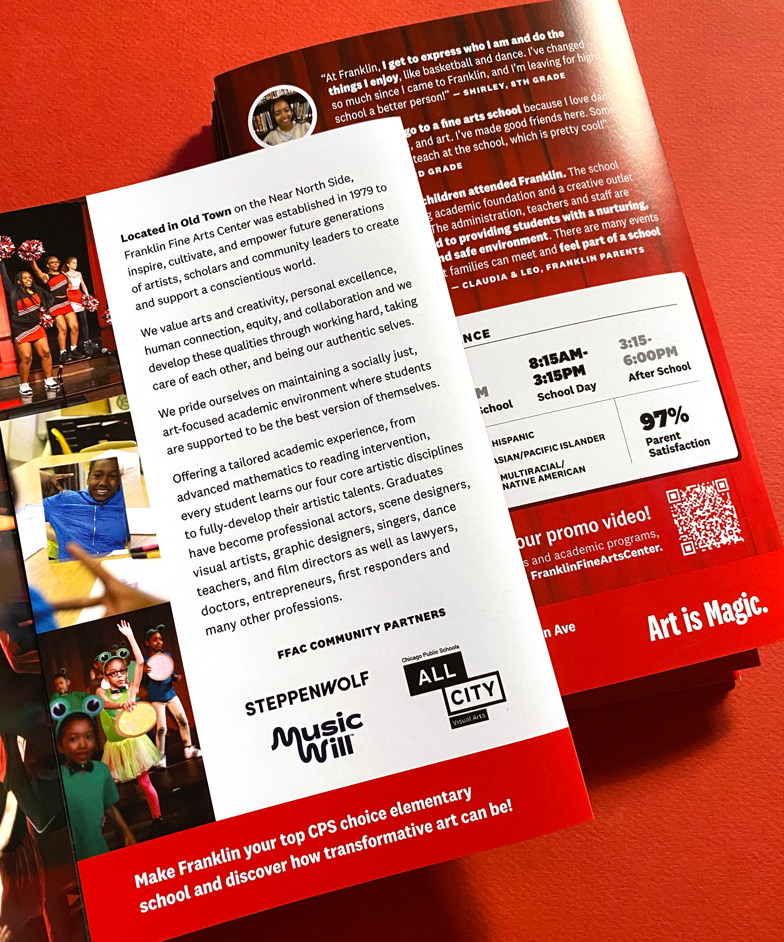
The print design serves two purposes. Folded up, it’s a typical tri-fold brochure, something small enough to easily hand out and carry around that includes an overview of the school, quotes from students and parents, and a few other important details. But when the brochure is opened up it becomes a standalone marketing poster the school can post around the city. It includes evergreen copy and we made sure it didn’t include information that would quickly become outdated the following school year.