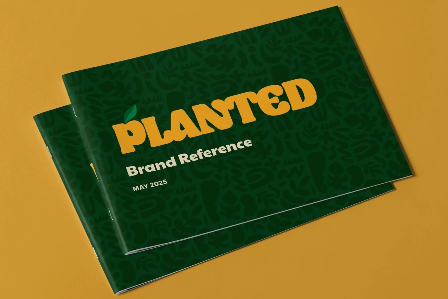
Logo Renovation & Visual Identity Development for Planted Inc.
Planted Inc. is an end-to-end user platform that connects cannabis consumers, brands, dispensaries, producers, employees, banks, and other businesses within a single app. The company was in need of a working visual identity but only had a logo which was quickly designed for an investor pitch deck. The CEO and I had a conversation about the current logo and what their needs were and suggested some improvements. Since it was already in use and the company was still in its infancy he didn’t want a jarring redesign, but agreed it should be evolved.
Below is the process behind redesigning their logo, giving them a much more own-able logo that includes more meaning and depth the original did not.
Planted’s original logo. Or is is PlanTed?
1 - the “leaf”
The CEO requested the leaf was moved to the ‘P’ which I was aligned with—he also wanted an icon that could be used where the full logo could not and it made the most sense to use the P. (While I appreciate the original designer’s effort not to embrace the obvious, sometimes you end up creating a logo that includes what looks like a burning effigy if taken out of context.)
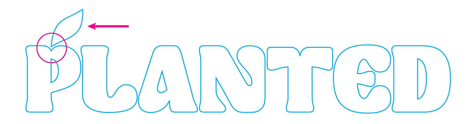
Moving the leaf happily made the ‘P’ resemble a piece of fruit. I wanted to enhance that element more so I enlarged the bottom of the lobe, plumping up the shape.
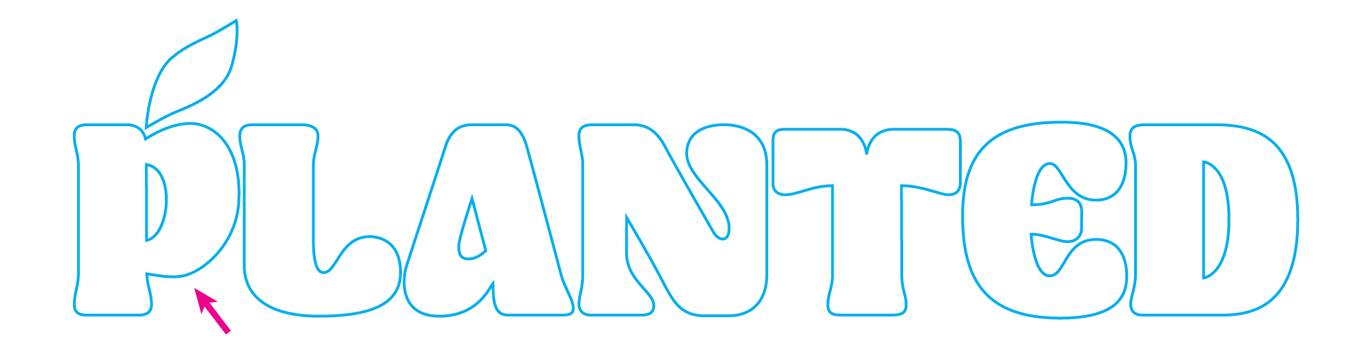
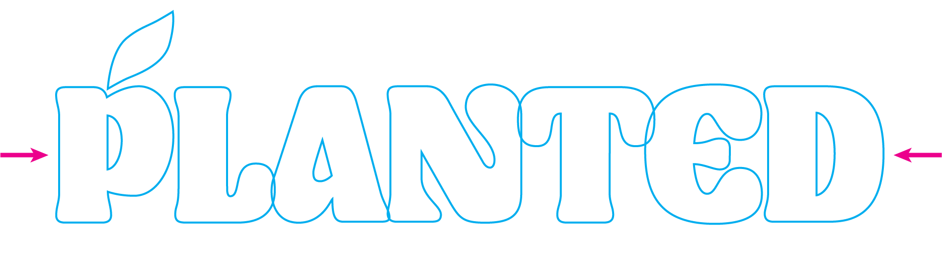
2 - Tighten the form
Prior to altering the ‘P’ some (many?) of the letter forms felt out of balance or off-grid. The letterforms were updated and I used those shape to create a new ‘L’ and ‘T’, unifying the baseline and cap-height.
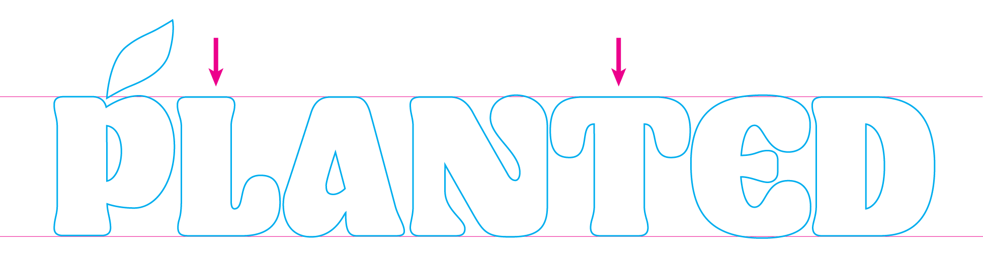
I also incorporated a symbolic-nod to the app’s purpose of connecting people by tightening the kerning, until the inner letters overlapped. The connectivity added an element of playfulness, the letters now interacting with one another.
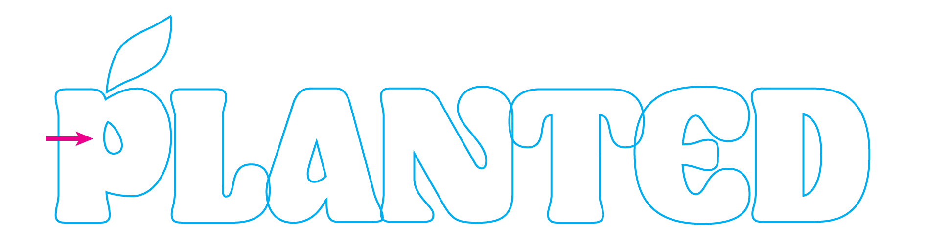
3 - a deeper meaning
One of the things that makes Planted unique is their “seed-to-sale” compliance—meaning they have the infrastructure in place to track a seed through the entire production chain—a crucial step to conduct business with banks within the marijuana industry, and a large hurdle for most dispensaries which is why many are still cash-only.
During the process of conceptualizing ways to imbue meaning into the logo, I kept thinking that if seeds are that important to Planted, one should be included in some way. Then it hit me, if the ‘P’ already looks like a piece of fruit then why not alter the eye of the ‘P’ to create the shape of a seed? It’s a subtle nod and provides an additional layer of meaning, adding complexity to Planted’s fairly simple branding.
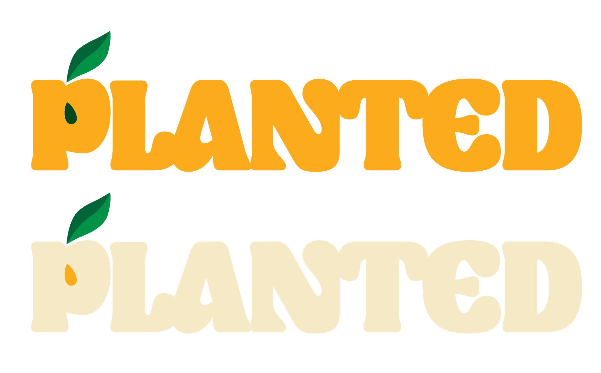
4 - Refine the Colors
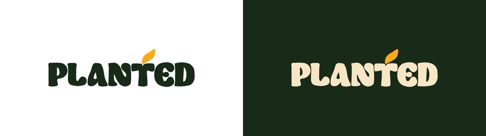
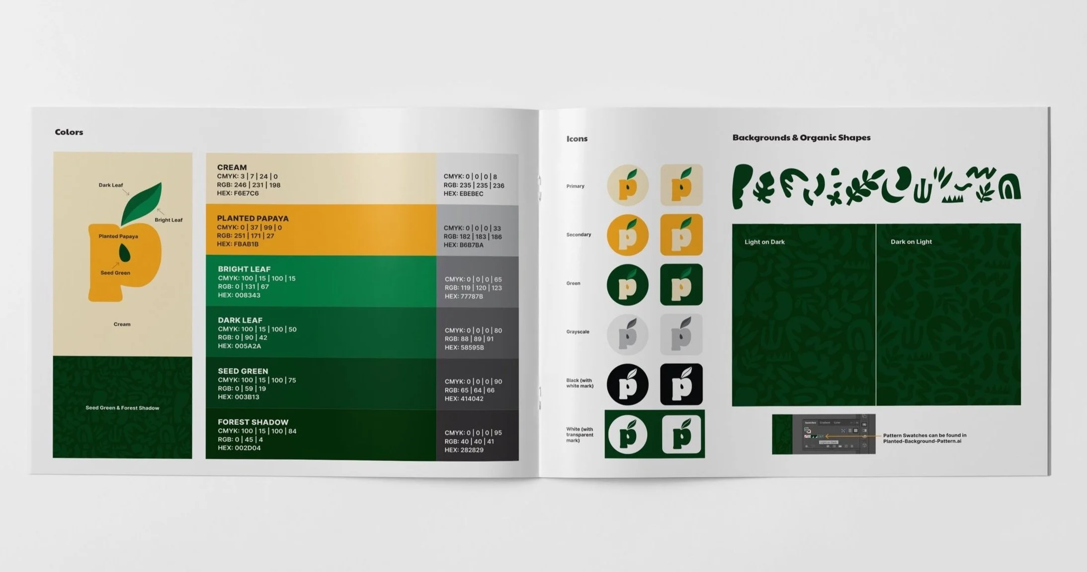
With the logo form finalized, the colors were the last element to dial in before handing over to the client for use. I kept the orange and cream colors, but modified the two greens used so they were brighter and more saturated.
Several options were provided and they settled on the orange lettering with a dual colored green leaf as the primary logo. A cream version was created for special use while grayscale and solid white and black versions were created for non-color applications.
5 - Define visual elements
Icons (aka Marks) were created and a background pattern was refined to include the new Planted seed shape and color palette, rounding out their visual identity into a quick reference document.
Outcome
Planted now has a more thoughtful visual identity, own-able options for many marketing uses, and is on a solid path towards building a lasting brand.