Logo Design & Visual Identity for Mobile Tech
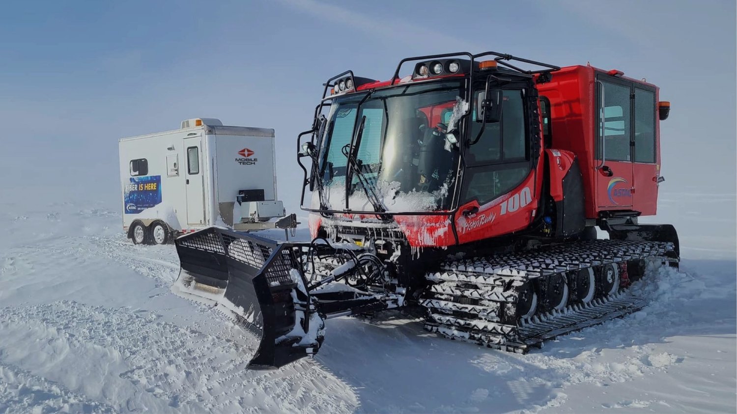
Mobile Tech specializes in building custom trailers and products for a range of industries—communication, television production, construction, hospitality, governmental, and more. If you need to lay down fiber optic cables in the arctic circle in the comfort of a heated room, specially laid out for your tools and gear they’re the ones to calls. They originally contacted the agency I worked for at the time because they wanted a new website but were quickly convinced if they truly wanted to make a better outward impression they needed to start with a stronger visual identity.
The logo I designed for them incorporates elements of their brand persona, the “Explorer”, and purpose, “to make cool shit”, as the owner so eloquently put it. At heart Mobile Tech is a brand who desires freedom and exploration. In reality, they create custom trailers and products, enabling any company to work anywhere on the planet giving them a little independence and adventure along the way.
Because their products facilitate work all over the world I wanted to incorporate an element of being in a remote, rugged location or some way to imbue that far-flung spirit into the logo. After some exploration of my own I landed on idea of using the a “GPS arrow” used for maps and location services as a starting point.
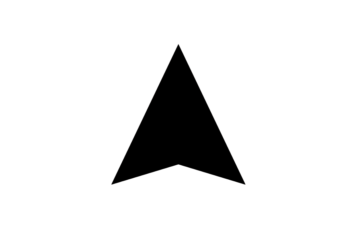
The modified shapes create an abstract world map, the four quadrants representing the remote “corners of the earth” where Mobile Tech excels.
A fresh tagline “Making Anywhere Possible” was crafted which was typeset along with the company name in Widescreen, a dynamic font that I also used for their editorial styling.
Their new visual identity creates an optimistic, rugged, and independent spirit which exemplifies the industrial and utilitarian nature of their products.